Amora Beauty Clinic Design Case Study
This case study highlights the strategic design process behind the brand identity for Amora Beauty Clinic, a project that seamlessly blends aesthetic elegance with the clinic's mission of authentic skincare.
The Brand
Amora Beauty Clinic is a premier cosmetics brand specializing in curated skincare products and authentic supplements. Operating in both the wholesale and retail sectors, they are dedicated to safety, effectiveness, and the transformative power of self-care.
The Creative Challenge
The objective was to move beyond the typical "clinical" look of beauty brands. We needed an identity that felt both approachable and authoritative—a brand that signals "trust" to wholesale partners while evoking "luxury and glow" for individual retail customers.
The digiWEB Creative Process
1. Conceptualization: The "Amora" Motif
We began by dissecting the core elements of the brand: love (Amora), radiance, and structured care. The brainstorming sessions led us to a monogram-led architectural approach. We wanted the logo to feel like a window into a sanctuary.
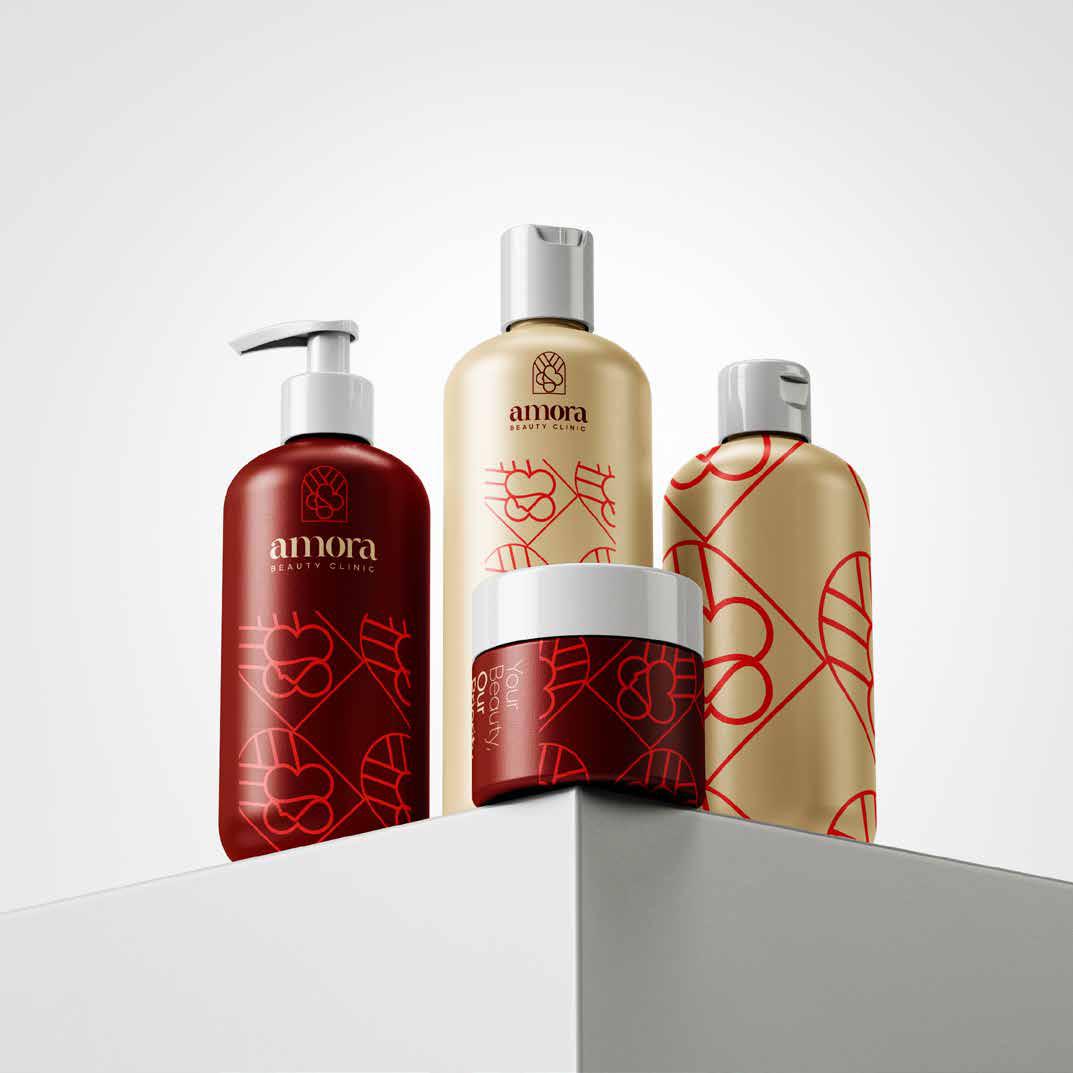
2. Visual Symbology
The Arch: Inspired by classic apothecary windows and clinic entrances, the arch symbolizes a gateway to transformation and professional expertise.
The Floral Geometry: Inside the arch, we integrated fluid, organic lines that suggest both a blooming flower and the contours of a radiant face. This represents the "natural beauty" Amora aims to enhance.
The Infinite Pattern: To extend the brand beyond just a logo, we developed a secondary geometric pattern. This tessellation creates a sophisticated rhythm, ideal for premium packaging, tissue paper, and digital backgrounds.
3. Typography & Color Palette
Typography: We paired a high-contrast, elegant serif for "amora" to convey premium quality, with a clean, wide-spaced sans-serif for "BEAUTY CLINIC" to maintain a modern, clinical precision.
Color Story: Moving away from standard clinical whites, we opted for a Warm Terracotta and Cream palette. This "earth-to-skin" color scheme feels organic, high-end, and deeply soothing.